Having a great author website is an important step toward becoming a successful author. If you’re doing it right, you will increase your audience, grow your engagement, and look more professional. How do you do it right? What do the best author websites have in common? Here are the 7 website design features that all good author websites have:
1. A good author website is mobile friendly.
The majority of internet users browse the web on a mobile device like a smartphone or tablet. If that doesn’t grab your attention, know that recent numbers estimate that three quarters of the world will only use their smartphones to access the internet by 2025.
If your website is not mobile friendly, then most internet users are not seeing you at your best (or seeing you at all) when they find you online. Many older websites are not optimized for mobile traffic, and often suffer from long load times and broken menus. Try visiting your website from your phone and ask yourself, “Is navigating my website easy? Can I buy my books quickly from a mobile device with my current layout?” If the answer is no, then you need to update your website.
The example below illustrates how Rachel Van Dyken’s website works seamlessly on both mobile and on a regular sized laptop screen.
2. Good author websites are the masters of their domain.
The domain name is what users type into their browser to get to your site. Having a custom domain gives you credibility and is a must-have in today’s digital age. Think about it: Readers are less likely to click on janeaustenauthor.blogspot.com than janeaustenauthor.com. With your own domain name you will appear more professional to readers, agents, and potential publishers. Owning a domain typically costs less than $20 a year and is a worthwhile investment in your books. Domain.com is a great place to start when embarking on the domain-purchasing process.
3. A great author website puts books front and center.
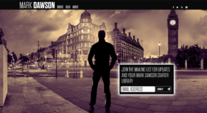
There are thousands of different ways to design a website, and all are optimized toward a specific purpose. Since you are an author, the main focus of your website should be your books. Make your titles the focus of your site and make your “Books” page one-click away from the home page (as you can see in the header on Mark Dawson’s site). Make it easy for readers to purchase your books by having buttons or clearly link text that point readers to the retailer of their choice.
4. Great author websites set the tone for readers.
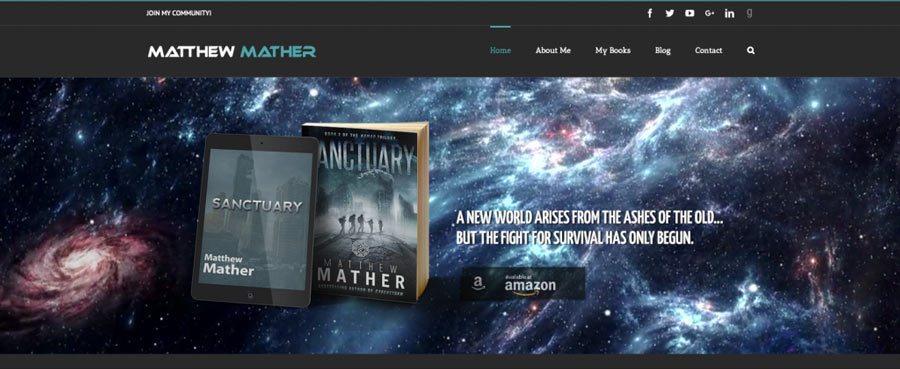
Beyond what’s written on a website, visual cues are important to let the reader know what to expect from your site. Use elements such as color, imagery, and font to quickly and efficiently give the reader a taste of your personality and brand. If you write gritty urban thrillers, you don’t need to have images of spring meadows and daisies on your homepage. If you write horror, pink is probably not the best accent color for your “Books” page. Be as creative as you want, but don’t go so far outside of your genre that you confuse the reader.
5. The best author websites make it easy for readers to join your mailing list.
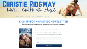
Email lists are incredibly important to authors. Email marketing is the most effective marketing channel for all types of businesses, and this includes yours. Dedicated readers are the ones who will find your website, so make sure that you have a quick and easy way to sign up for your list. If possible, give visitors an incentive to sign up for your email list – such as a free chapter or a free eBook. Extra points for telling readers what types of emails you will be sending them – this creates another level of trust and makes the value of being on your list clear to the reader.
6. The best author websites make it easy to get in touch.
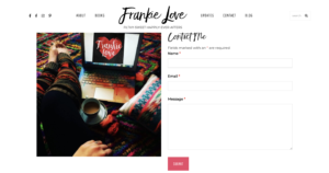
How easy is it for the press, publishers, or Hollywood agents to contact you? Publish a contact form on your site where readers or the press can reach you. We have had members of the press tell us that if they cannot easily find contact information for an author, they move on to someone else who has made it easy to get in touch. Make sure to check the entries to the contact form a few times a week or have it forwarded directly to your email address. If comfortable publishing a contact email address, you can simply put your email on the contact page (thought this can result in lots of spam, so be careful). Even if you don’t get a lot of inbound inquiries, it only takes one email from a publisher or agent to change a writer’s career.
7. An engaging author website plays nice with social media.
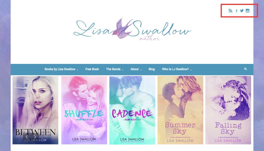
Readers love to engage with authors on social media. They know that following their favorite author on Facebook, Twitter or Instagram is a great way to be notified of sales, sneak peaks, and more. Place follow buttons to all of your social profiles in an easy to locate spot so readers can follow you with the click of a button. Most websites put social links in the header or footer, so that’s where readers look for them. Stay on trend and make sure your links are in the header or footer as well, if you want to put them in other places as well, go for it.
Website building technology gets better and better. Every author can quickly and easily build (or rebuild) their site in less than a day. The beauty of building your own site is that you can easily update it whenever you need and with no additional cost. We have created a free course that walks you through how to set up a website, and we also have our fantastic step-by-step guide to building an author website.
Ready to get started?


Thanks for sharing
Cheers to Everyone at Written Word Media!
Thank you for your help and support. Keep up the good work.
It was nice reading this piece,the information is so on touch.Cheers.
It’s a great source of knowledge; I think it will be helpful for lot of people who are looking for author website design 7 must have features for all author websites. Thank you very much for sharing this article, this is really helpful for me, thanks again!If possible visit this website Flightdigital.co.nz to gain more idea or tips on the same.
Like!! Thank you for publishing this awesome article.
This is a very informative blog, thanks for sharing about author website design 7 must have features for all author websites. It will help a lot; these types of content should get appreciated. I will bookmark your site; I hope to read more such informative contents in future.
I notice some writers keep a scrolling Home page and a menu above that takes reader into the books, which are then have their own scrolling pages. I have a static home page with the menu above. Does it matter? And how do you add a landing page without obscuring the Home page? Mark Dawson’s site is an example. Thanks for any comment.
Hey Regina,
Great question. Scrolling or static pages both should work well, if there’s no scroll on your homepage, you may want to consider adding more content below the top, to further engage readers. Scrolling is easier than clicking, so maybe you can list previews of your other pages on your homepage, as well as in your menu.
A landing page is simply any page you drive traffic to. So if you want to create a landing page that only has an email signup, and very little else in order to keep the reader’s attention, you can create that page, and simply direct your ad traffic to it. If the reader lands on your landing page, and wants to learn more, they can click your logo or home in the menu above, to get to the Home page that has more information.